

Stop fixing error messages. Start fixing systems.
Error messages aren’t writing problems—they’re system design problems

You’re trying to book a flight. You fill out the form. You click ‘Continue.’
Error: Invalid input.
Invalid... what? Which field? What did I do wrong? You scan the form. Everything looks fine. You try again. Same error.
You change your phone number format. Nothing. You remove the middle initial. Nothing. You try a different credit card. Still nothing.
Finally, after 10 minutes of trial and error, you discover the issue: your passport expires in 5 months, and this airline requires 6 months validity.
The form never mentioned this. The error never explained this. You wasted 10 minutes because someone wrote a lazy error message.
Here’s what that error message revealed: This isn’t a copywriting problem. It’s a system design problem.
Most ‘error message problems’ are actually problems with error prevention, detection, or recovery systems. The copy is just where the broken system becomes visible.
Fix the system, and the copy writes itself.
The error prevention pyramid
Good error experiences happen in four layers, from top (best) to bottom (last resort):
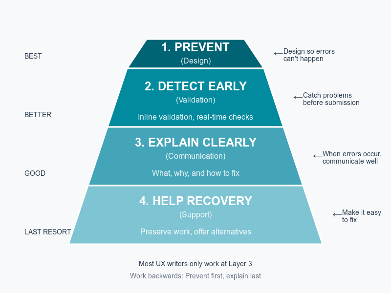
Most UX writers? They only work at Layer 3 (writing the error message). That’s the worst place to solve the problem.
But…the challenge is in implementation :|
You’ll show this pyramid to your engineering team. They’ll nod. They’ll agree it’s better to prevent errors than write messages. Then they’ll say:
“We don’t have budget for this quarter. Just write a generic error message for now.”
Getting Layers 1 and 2 approved means you’ll need data—ROI calculations, pilot proposals, business impact numbers. That’s a whole separate skill set.
If you need help with the organizational side, check out this article for tactics on getting these changes approved:

For now, let’s focus on the framework itself. Understanding what good looks like is the first step.
The pyramid in practice: Breaking down each layer
Layer 1: Prevent (design)
The principle: Make errors impossible.
Examples:
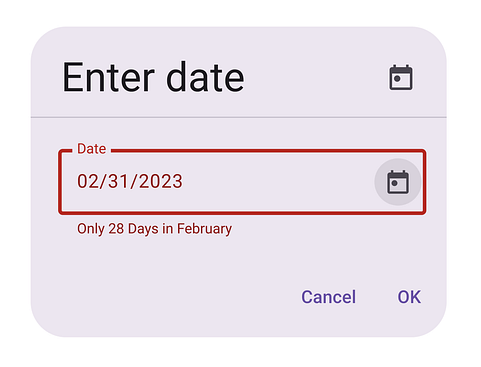
Date picker instead of text field (can’t enter invalid dates)
Dropdown instead of free text (can’t misspell options)
File upload with format restrictions (can’t upload wrong file type)
Disable ‘Submit’ until form is valid (can’t submit incomplete form)
Show password requirements as you type (can’t create weak password)
Why is this the best? Because users never see an error. They can’t make the mistake in the first place.
That means, you need to write proactive guidance and clear constraints, not error messages. The copy accompanying the input field needs to prevent the error before it happens:
Clear labels that explain constraints upfront (e.g., Choose PDF file (max 5MB))
Helpful placeholder text showing format (e.g., Enter a valid email address like yourname@example.com)
Microcopy next to fields explaining limits
Tooltips for complex requirements
The goal is to ensure that users understand what’s expected before they interact.
❌ Error message: File must be PDF

✓ Prevention: File picker that only shows PDFs with label Choose PDF file (max 5MB)
Layer 2: Detect early (validation)
The principle: Catch problems as they happen, not after submission.
Examples:
Inline validation as user types
Real-time format checking
Warning before leaving page with unsaved changes
Character counters showing limits
Availability checks (username, domain)
Why is this better? Because error message appears at the moment of mistake, when user can immediately fix it. Context is fresh.
That means messages should be specific, actionable, and inline. You also need to design the success state—showing when something is correct is just as important as showing errors.
❌ After submission: Form contains errors
✓ Inline validation: Email format should be name@domain.com
✓ Success indicator: ✅(no text needed—the green checkmark says it all. However, for accessibility, you could validate with “Email entered in correct format”.)
The success state matters. When users see the green checkmark appear as they type correctly, they’re building confidence. The absence of an error is powerful feedback.
Layer 3: Explain clearly (communication)
The principle: When errors happen, communicate what, why, and how to fix.
This is where most UX writers focus. It’s important, but it’s clean-up—not prevention.
Examples:
Clear error messages
Specific explanations
Actionable next steps
Context about what went wrong
Why this is necessary but not sufficient: Even perfect error messages create friction. Users still had a failure.
Layer 4: Help recovery (support)
The principle: Make fixing errors as easy as possible.
Examples:
Preserve all user input and state (don’t clear the form, retain selected files)
Focus cursor on error field
Offer alternatives (couldn’t process payment → try different card)
Provide support contact if user is stuck
‘Undo’ options after destructive actions
Why this matters: Recovery reduces abandonment. Users who hit errors need a path forward, not just an explanation. Losing their work or having to start over dramatically increases frustration and abandonment rates.
Anatomy of a bad vs. good error system
Scenario: User uploading a profile photo
❌ Bad error system (Layer 3 only)
What the user experiences:
User clicks ‘Upload photo’
Selects a 10MB .HEIC file from their iPhone
Clicks ‘Save’
Page loads for 5 seconds
Error appears: Upload failed. Try again.
What’s wrong:
No prevention: Allowed selection of unsupported format
No early detection: Didn’t check file before upload
Poor explanation: Upload failed doesn’t explain why
No recovery help: Try again isn’t actionable—user has to re-select the file and doesn’t know what to change
Lost context: User has to remember what they did
The error debt checklist:
The ‘error message’ problem is actually 4 system problems:
Prevention failure: File picker accepts all files (should restrict to supported formats)
Detection failure: No client-side validation before upload (should check immediately)
Communication failure: No progress indicator AND vague error message (should explain what, why, how)
Recovery failure: User loses selected file with no alternatives suggested (should preserve work and offer options)
✓ Good error system (All 4 layers)
Layer 1 - Prevent: File picker shows only supported formats Label: Upload photo (JPG, PNG, max 5MB)
This prevents
Wrong file format
Files too large
Confusion about what’s acceptable
Layer 2 - Detect early: Client-side check before upload starts:
User selects file ➡️ JavaScript checks format and size ➡️ If invalid, show immediate feedbackIf HEIC selected:
iPhone photos need to be converted to JPG first.
Would you like us to convert it for you?

[Yes, convert] [Choose different photo]
If file too large:
This photo is 10MB. Maximum size is 5MB. We can compress it for you.

[Compress & upload] [Choose different photo]
This prevents
Wasted upload time
Server errors
User frustration
Layer 3 - Explain clearly: If something still goes wrong (network failure, server issue):
We couldn’t upload your photo because of a connection problem. Your internet connection may be unstable.

You can:

- Check your internet connection
- Try uploading again
- Use a smaller photo

[Try again] [Need help?]
This provides
Clear explanation
Likely cause
Multiple solutions
Specific actions
Layer 4 - Help recovery:
File they selected is still shown (don’t make them re-select)
‘Try again’ button pre-filled with their photo
‘Need help?’ link to support chat
Option to save profile without photo and add it later
This provides
No lost work
Multiple paths forward
Human support if needed
Escape hatch to continue
The copy in the good system is better because the system is better.
Common error types & system solutions
Type 1: Format/validation errors
❌ Lazy system: User submits form → Server rejects it → Invalid email format
✓ Better system:
Input type=’email’ (browser validation)
Placeholder showing format: name@example.com
Inline validation as they type
Green checkmark when valid format entered
Copy needed:
Label: Email address
Placeholder: name@example.com
Inline validation: Enter a valid email (you@domain.com)
Success indicator: ✓ (no text needed)
Type 2: Permission/access errors
❌ Lazy system: User clicks feature → Access denied. Error 403.
✓ Better system:
Don’t show features user can’t access (prevention)
If shown, disable with explanation before click (detection)
If clicked, explain what access they need (communication)
Offer path to get access (recovery)
Copy needed:
Disabled state: Team plan feature with lock icon
Hover text: Available on Team plan. Upgrade to access →
If somehow accessed: This feature requires Team plan. [See plans] or ask your admin to upgrade.
Type 3: Dependency/prerequisite errors
❌ Lazy system: User tries to export data → Cannot export. No data available.
✓ Better system:
Check for data before showing export option (prevention)
If no data, show empty state with ‘Import data first’ (context)
Export button only enabled when data exists (prevention)
If error occurs: explain what’s needed (communication)
Copy needed:
Empty state: No data to export yet. [Import data] to get started.
Disabled button: Export (no additional text needed—it’s clear from context)
If error: You need to import data before exporting. [Import data] or [View sample data]
Type 4: Timing/state errors
❌ Lazy system: User tries to edit published document → Cannot edit. Document is published.
✓ Better system:
Check state before showing edit option (prevention)
Show current state clearly: ‘Published’ badge (context)
Change ‘Edit’ to ‘Create draft to edit’ (prevention through clarity)
Or allow editing but warn about republishing (recovery)
Copy needed:
State indicator: Published • Dec 4, 2024
Action: Unpublish to edit or Create new draft
If error: This document is published. Unpublish it to make changes, or create a new draft. [Unpublish] [Create draft]
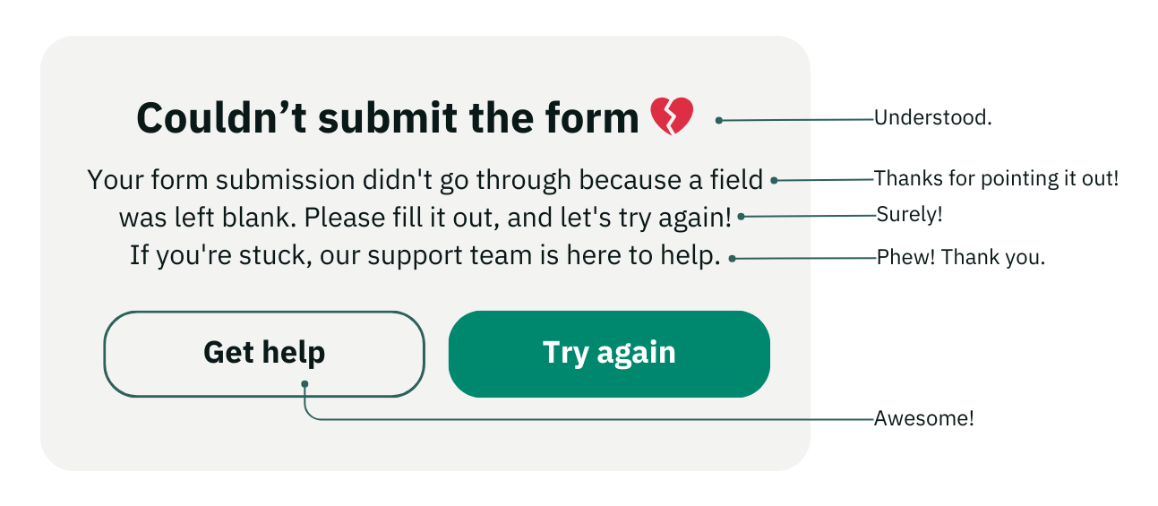
The error message checklist (when you must write one)
Sometimes errors are unavoidable (server crashes, network failures, third-party API issues). When you must write an error message, use this framework:
The W-W-A-O-S template
W - What happened? W - Why did it happen? A - Action they can take O - Option (alternative path) S - Support (who can help)
1. What happened?
Be specific, not generic
❌ Error occurred
✓ Payment failed
2. Why did it happen?
Explain the likely cause
❌ Payment failed
✓ Payment failed because your card was declined
3. What action can they take?
Provide actionable next steps
❌ Payment failed because your card was declined
✓ Payment failed because your card was declined. Try another card or contact your bank.
4. Is there an option (alternative)?
Offer different paths forward
✓ Payment failed because your card was declined. Try another card, contact your bank, or pay with PayPal instead. [Try another card] [Use PayPal]
5. Who can provide support?
Provide help if user is stuck
✓ Still having trouble? Contact us at support@company.com or chat with us.
The complete W-W-A-O-S template:
[WHAT] happened because [WHY].

[ACTIONS you can take]:
• [Action 1]
• [Action 2]
• [Action 3]

[Primary button] [OPTION: Alternative button]

Still stuck? [SUPPORT link]
Examples:
We couldn’t process your payment because your card was declined by your bank.

What you can try:
• Check that you entered your card details correctly
• Try a different payment method
• Contact your bank to authorize this charge

[Try again] [Use different card]

Still having trouble? Contact support
Interactive exercise: Fix these broken systems
I’ll give you three bad error messages. Your job: don’t just rewrite the message—redesign the system.
Scenario 1:
Error message: Username already taken
Your task:
What prevention could you add?
What early detection could you add?
How would you rewrite the message?
What recovery help would you provide?
Scenario 2:
Error message: Your session has expired. Please log in again.
Your task:
What prevention could you add?
What early detection could you add?
How would you rewrite the message?
What recovery help would you provide?
Scenario 3:
Error message: Cannot delete. This item is being used.
Your task:
What prevention could you add?
What early detection could you add?
How would you rewrite the message?
What recovery help would you provide?
Instructions: Apply the error prevention pyramid. Think about all 4 layers before writing copy.
Exercise solutions
Scenario 1: Username already taken
Layer 1 - Prevent: Can’t fully prevent (someone else registered it), but can suggest alternatives as they type
Layer 2 - Detect early: Real-time availability check as user types Show: ✓ johndoe123 is available or ✗ johndoe is taken
Layer 3 - Explain clearly: This username is already taken. Try one of these available alternatives: • johndoe123 ✓ • johndoe2024 ✓ • john_doe ✓ Or try a different username
Layer 4 - Help recovery:
Pre-populate suggestions they can click
Keep their original choice visible
‘Generate random username’ option
Let them proceed with email login if username isn’t mandatory
Scenario 2: Session expired
Layer 1 - Prevent: Auto-refresh session in background during activity Show indicator when session will expire: Session expires in 5 minutes
Layer 2 - Detect early: Warning 2 minutes before expiration: Still there? Your session will expire in 2 minutes. [Stay logged in]
Layer 3 - Explain clearly: Your session expired after 30 minutes of inactivity for security. We saved your work.
[Log in to continue]
Layer 4 - Help recovery:
Auto-save work before session expires
After re-login, return them to exact spot
Show what was saved: Your draft was saved. Continue where you left off.
Scenario 3: Cannot delete item in use
Layer 1 - Prevent: Before they click delete, show: Used in 3 projects Change button to ‘Cannot delete (In use)’ or hide delete option
Layer 2 - Detect early: When they click delete, show modal before attempting: This item is used in: • Project A • Project B • Project C
Remove it from these projects first, or archive it instead. [View usage] [Archive instead] [Cancel]
Layer 3 - Explain clearly: Cannot delete this item because it’s being used in 3 projects. Remove it from those projects first, or archive it to hide it without breaking those projects.
Layer 4 - Help recovery:
Show which projects use it (clickable links)
Offer ‘Archive’ as alternative to delete
‘Remove from all & delete’ option with warning
Batch remove + delete in one action
Your new responsibility
You’re not just a writer. You’re a systems thinker. When someone asks you to ‘fix the error message,’ push back:
Before I write better copy, let’s fix the system:
Can we prevent this error?
Can we catch it earlier?
Can we help users recover?
Then I’ll write the message.
Your job isn’t to make errors sound nice. It’s to make them unnecessary.
Choose systems thinking. Every time.
What’s next
Dec 19, we shift gears into AI and conversational design. We’ll tackle prompt engineering for content designers—how to write prompts that generate consistent brand voice in AI-generated content.
It’s one of the most practical skills you need right now, and we’ll apply the if-then-else logic to prompt design.
— Mansi
Your UX Writing Bud
Found this useful? Here’s how to apply it.
Send me your error system - Got an error message that’s really a system problem? DM me on Substack. I might feature it (anonymized).
Share with your team - Forward this to designers and engineers. Help them see errors as system failures, not copy problems.
Tell me what you fixed - Redesigned an error system using the pyramid? Reply and let me know what changed.
Support this work - If this framework changed your approach, buy me a coffee/book.
UX Writing Bud delivers frameworks and systems for content designers every Friday. Free, always.