

Error messages that don't frustrate users
A Guide to user-friendly communication

I’m trying a new format—Quick Insights—where I’ll share tips or guidelines to get out of a sticky situation. Quickly.
Let’s dive in with error messages that don’t frustrate the users, and we’ll be improving the following error text.
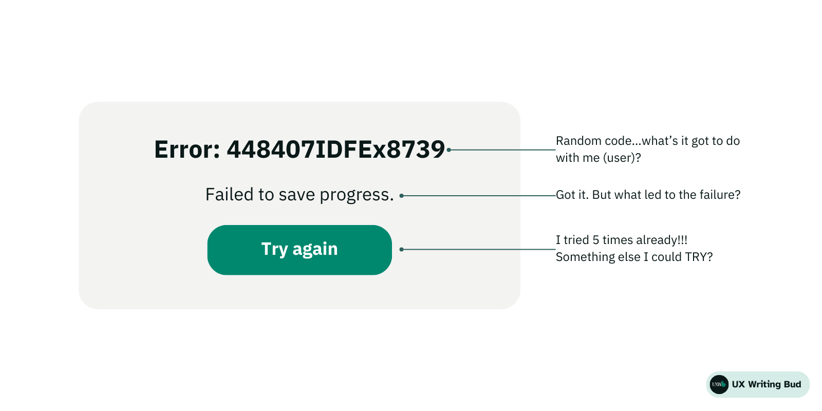
Alt text for the image: Error: 448407IDFEx8739 (Random code…what’s it got to do with the user?)
Failed operation. (Got it? But what led to the failure?)
Try again >> (I tried 5 times already!!! Something else I could TRY?)
For the uninitiated, UX Writing Bud translates UXW mumbo-jumbo to human so you can learn and kickstart your career with the least effort and monies. If that’s your jam…
Be clear and specific
Let the user know exactly what went wrong and what they need to do to fix it. Avoid technical jargon while doing so. You’re writing for real users of your products, not its developers.
Short and to the point
Stick to the essentials to make the messages read faster. And don’t use overwhelming words or sentence length.
Empathetic and positive tone
An empathetic tone helps users feel supported and understood instead of blamed or accused. Use positive words and a friendly tone to engage and encourage users.
Use icons and visuals
Visuals and icons can make error messages less intimidating and more engaging.
Solution-focused
Offering solutions is crucial. Users need to know how to resolve the issues they encounter. Clear solutions guide users toward a resolution, reducing frustration.
If they can’t solve it themselves
Offer clear instructions or alternatives if the problem cannot be directly resolved by the user, such as FAQs, support staff or a form to fill out.
Use humour carefully
Humour can ease tension, but it must be used judiciously considering your target audience. However, it should never undermine the seriousness of the issue.
Here’s a decision tree I use: <link post>
Test and tweak
Trial and error is the name of the game. Test your error messages with real users and keep making improvements.
Improved error message

Alt text for the image: Couldn’t submit the form 💔 (Understood.)
Your form submission didn't go through because a field was left blank. (Thanks for pointing it out!) Please fill it out, and let's try again! (Surely!) If you're stuck, our support team is here to help. (Phew! Thank you.)
Try again | Contact support (Awesome!)
Over to you
Writing effective error messages is about balance – providing enough information to be helpful, but not so much that it overwhelms the user. The tone should be empathetic and positive, focusing on solutions rather than problems. By adhering to these principles, you can turn potential points of frustration into opportunities for enhanced user engagement and support.
Remember, error messages are more than just notifications; they are integral to the user's journey through your product.
Feel free to reach out if you have any questions or want me critique your UX content via email or ADPList.
Care to share your thoughts on this newsletter? It’ll only take 2 minutes.